Design to Include
As Uber transitioned into a global mobility platform, I served as their Global Design Director, responsible for streamlining their design ecosystem and advancing their safety and accessibility initiatives.
To ensure the visual system aligned with their purpose, we created the Design to Include charter, which codified their inclusive design philosophy and drove accessibility improvements across Uber's web and product interfaces. The charter also extended the business strategy of the 2018 rebrand to Uber's design system, providing a cohesive vision for the multi-year program.
An Accessible Design System
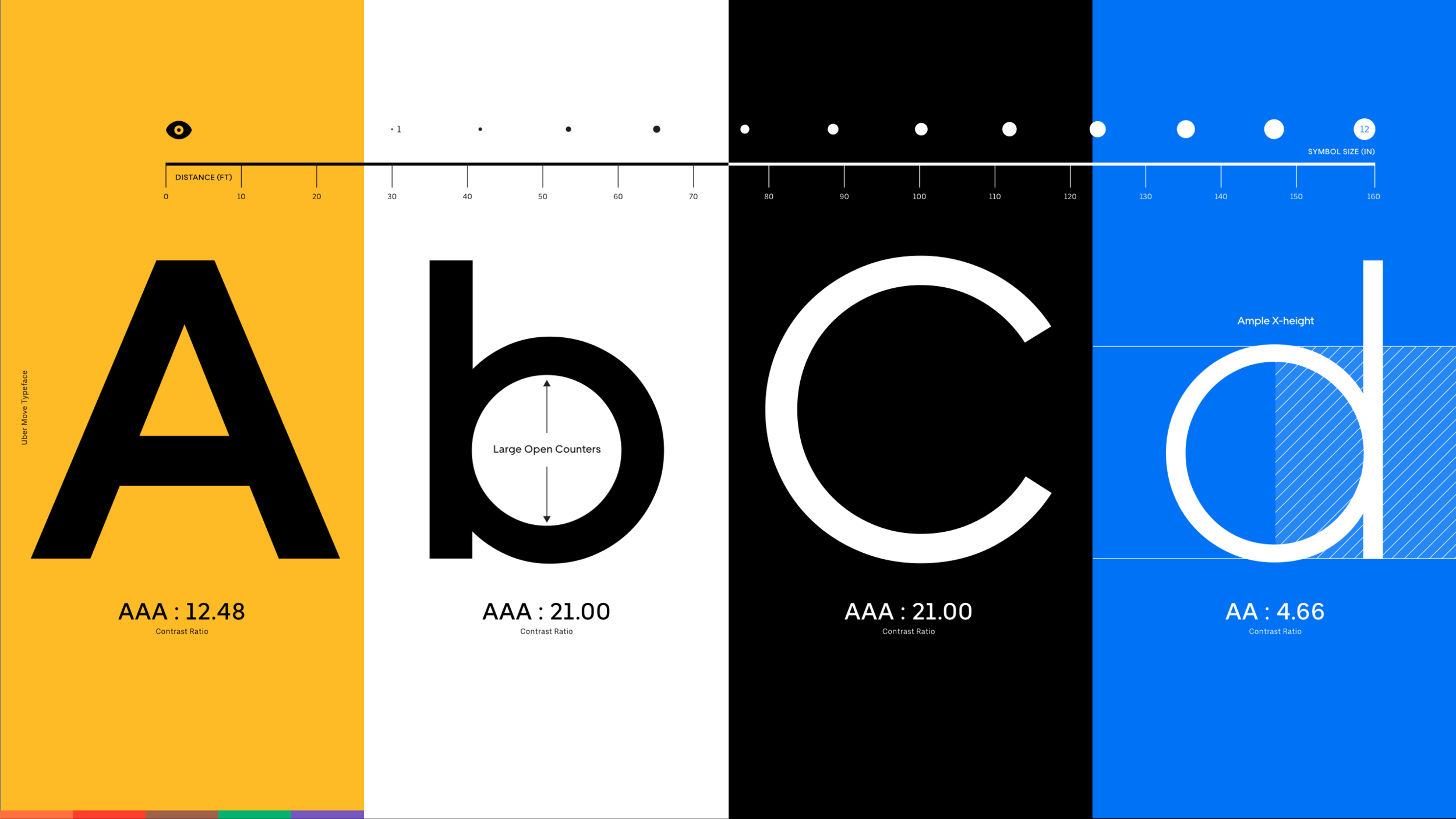
It was important that Uber’s design system tapped into the best practices of international design and trusted wayfinding systems. We were very much inspired by Ron Mace’s Universal Design philosophy, and made sure every aspect of the system achieved AAA ratings for legibility and was simple to understand and implement.
I led the development, testing, and implementation of Uber’s typeface, Uber Move. This typeface was 13 languages and designed by MCKL type foundry.
We implemented a highly scalable and inclusive illustration system to be used by creative teams globally.
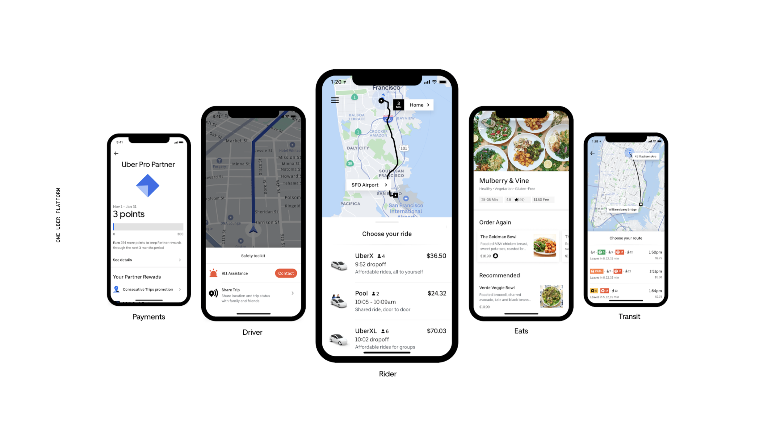
I served as interim product platform director post the rebrand to help implement and translate the new design system into all of Uber’s products.
A rebrand isn't complete without a launch day video. Below is the piece I directed with WO and presented to the company. The video showcases the insights from our research that guided the development of the new design system.
Safety Brand
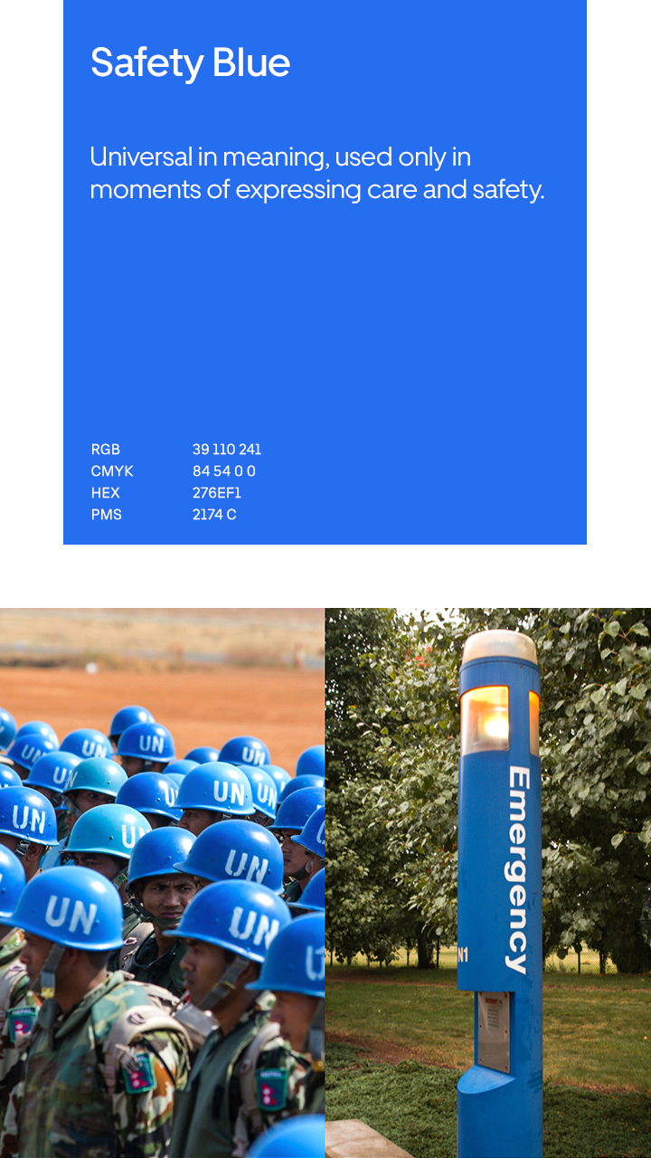
Perhaps some of the work I am most proud of was what my team working with marketing and product teams to improve the effectives of Uber’s safety experiences. By working cross-functionally we were able to increase CTR’s for safety CRMs, and raise awareness of safety features in product by making the entire customer journey consistent. Here is a sampling of that work which I will break out into its own case study soon.
Uber Lite
Brand is a promise, but product is the proof. Working in conjunction with the Uber lite team, we were able to deliver on our brand promise of accessible transportation for millions of riders in LATAM and India. Our role was to help build out the 13+ languages needed to serve these populations, and create a 5mb version of Uber’s traditional 250mb app.

The U Frame
In our collaborations with Wolff Olins on the rebrand, I had asked their Creative Director, Forest Young, “How can we find a way to make our imagery more ownable?” Their answer was the U Frame, a typographic margin of whitespace in the form of a U. This compositional device provides Uber endless narrative and interactive possibilities. Below is small sampling of the many ways we brought it to life across Uber’s brand, product, and marketing expressions.
Here’s a sampling of the ways my team brought the system to life across physical and digital experiences.
Below, mood boards for a driver documentary that utilizes the U Frame as a narrative device.
Uber Beacon illuminated trade dress. Fully case study here.
Part of the explorations with our partners on the Uber Safety team. Here using the U Frame functionally to highlight important information to the rider.
Spreads from our book on Uber Design entitled, “77 Things.” Full case study on this and Uber Design here.
Brand.Uber.com
Providing tools to an organization is key when it comes to keeping teams on brand. My team launched brand.uber.com for this purpose, but also used it as a platform for other teams to share their best projects in something we called Showcase.


